In our discussion of Man of the Crowd, we raised the concepts of Gestalt. As we explained there, Gestalt is a German word that means "shape" or "form." Specifically, it is an approach to understanding how humans organize and group visual elements into wholes. In his classic text, Art and Visual Perception, Rudolph Arnheim elevated the concept of gestalt to a method of interpreting and understanding the visual elements of art. As explained by Professor Arnheim:
For any spatial relation between objects, there is a correct distance, established by the eye intuitively . . . . [N]o known method of calculation can replace the eye's intuitive sense of balance.
Art and Visual Perception at 12, 19.
What's key to understand about gestalt is that the spectator evaluates each element within an image not only by its visual weight, but also within the entirety of the context provided by the artist. Significantly, both visual weight and the emotional or intellectual significance of an element will be interpreted mostly within the meaning of the frame, with less of the interpretation coming from the spectator's own knowledge because the determination of visual weight is largely dependent on comparators, and because forms, shapes, and objects will take on different meanings depending upon context. This is why understanding gestalt is important: it provides the artist with a great deal of control over how a spectator will understand an image.
A photograph is a container. It has borders and edges. Within this container is a convergence: the photographer's past witness, the spectator's enlightenment, and the present moment of the two being joined.
The meaning and symbolism of "clouds" is changed with the context of the subject. The "heavenly" meaning is enhanced because of the subject's pointing finger.
The human sense of gestalt is a natural outcome of how the brain operates. We don't perceive all that we see because that would be far too much information to have to consciously sort through, and would paralyze us. Instead, our minds do the heavy lifting of sorting, categorizing, structuring, and labeling visual information before it's passed on to our conscious perception. Understanding how spectators view art is vitally important to an artist who sketches or paints because it has to be contrived to make the artwork effective.
Street photographers have a different problem with gestalt because we are dealing with that which the world presents to us and do not have the option to contrive it, which makes understanding gestalt a different proposition. Rather than putting our attention on the structure of arranging elements to create a natural gestalt, we are lucky that we just need to recognize it and its effects. But that's no easy trick because photographers not only need to frame images to get a gestalt balance, but we also have to anticipate how what we are experiencing in the moment of taking pictures will be translated into the two-dimensional image our spectators will see.
Contrast helps the spectator separate figure from ground. Elements like the poles in this image reinforce the standing subjects, while the reflections on the rails emphasize the horizontal train platform and provide cues for depth.
Understanding gestalt first requires accepting its dual nature: it's purely natural and extremely sensitive, but it's only activated in artificial ways. It's only when we have an object that has a comparator that we can make a gestalt evaluation of balance. Photographers not only have to see those contrasts as we interpret a scene, but we also have to select how to frame them to maximize their effect for the spectator.
Gestalt has its greatest impact through the use of symbolism and contrast. So as you explore gestalt, we highly recommend you photograph achromatically. If you're lucky enough to have a Fuji X100s, start here. If you have another camera, figure out how to make it shoot black and white.
Activation
Applying gestalt is hard: it requires understanding the concepts, as well as thinking in two-dimensions while you're making images, recognizing ideas, and framing the moment with the spectator in mind.
Luckily for photographers, though, activating the gestalt sense itself is relatively easy! Gestalt shows itself when we view elements within boundaries and frames. Accordingly, all you need to do to start improving your gestalt is to lift your camera to your eye!
As simple as this sounds, there are a few caveats. First, you have to use a camera with a viewfinder. Making images using an LCD back (or with an iPhone or other smartphone) won't make your brain switch on its gestalt evaluation because you'll have too many other visual reference points. Instead, you need to close one eye, and look through the viewfinder with the other.
Also, looking through a viewfinder is different from merely seeing through a viewfinder. The trick is to treat the viewfinder as all that you know. Don't just examine the subject and check the camera's settings in the display. You must look at the viewfinder as you would a finished print: look at the background, the corners, the details. Make decisions about focus and depth of field based upon *all* the elements in the frame. You can't make up for a poorly executed image by cropping it in post-production. Instead, you need to be making all framing decisions *in camera* at the time of making the image. You should develop every image full frame. If you don't treat the viewfinder as the entirety of the image you are making, gestalt will be sorely lacking and your images will suffer.
Attentional Blindness
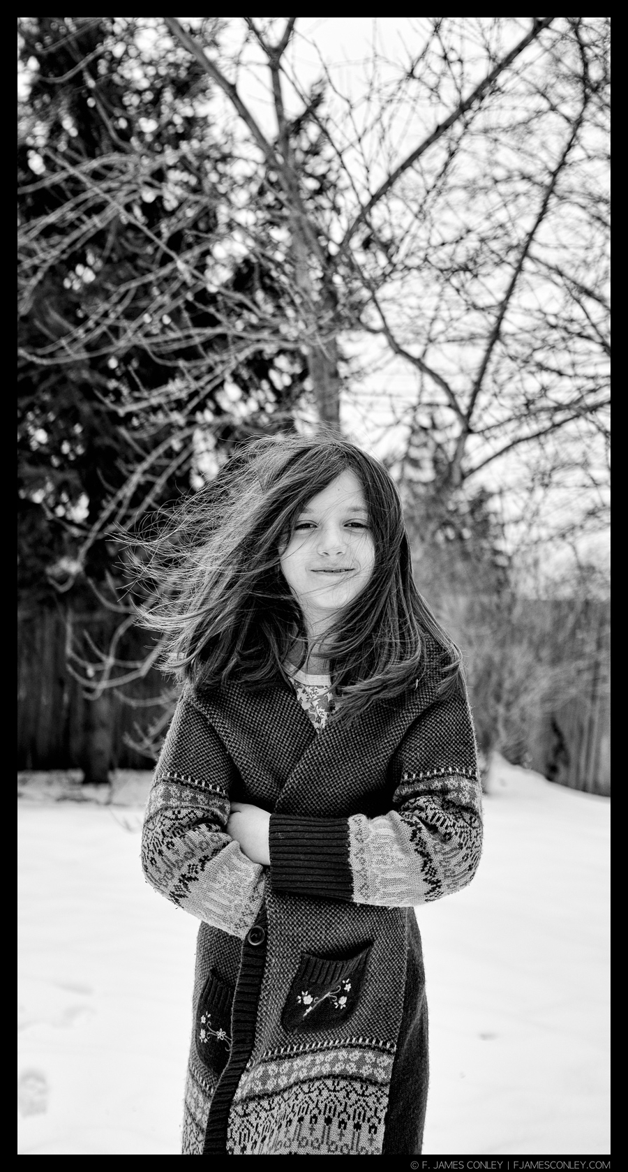
The first image below is an example of what happens when we concentrate on the subject instead of looking at the whole frame. Whether it's trying to time an expression or just being interested in our subject, we become blind to the frame and the gestalt when our attention is narrow—and then it's easy to wind up with a tree growing out of a head. Yes, bokeh can help. But you can't fix in post-processing what wasn't captured at the time the image was made.
This is a very common problem with portraits because as photographers we want to make our subject look good, and we oftentimes try to evoke a certain look by communicating with the subject. While that emotional connection may feel good in the moment, those very same emotions direct the visual attention to the subject to the exclusion of the frame. (This is the simple behavioral phenomenon of looking at someone when we are talking: we are looking for facial feedback. That's great for communication, but lousy for the visual awareness required to make good images.)
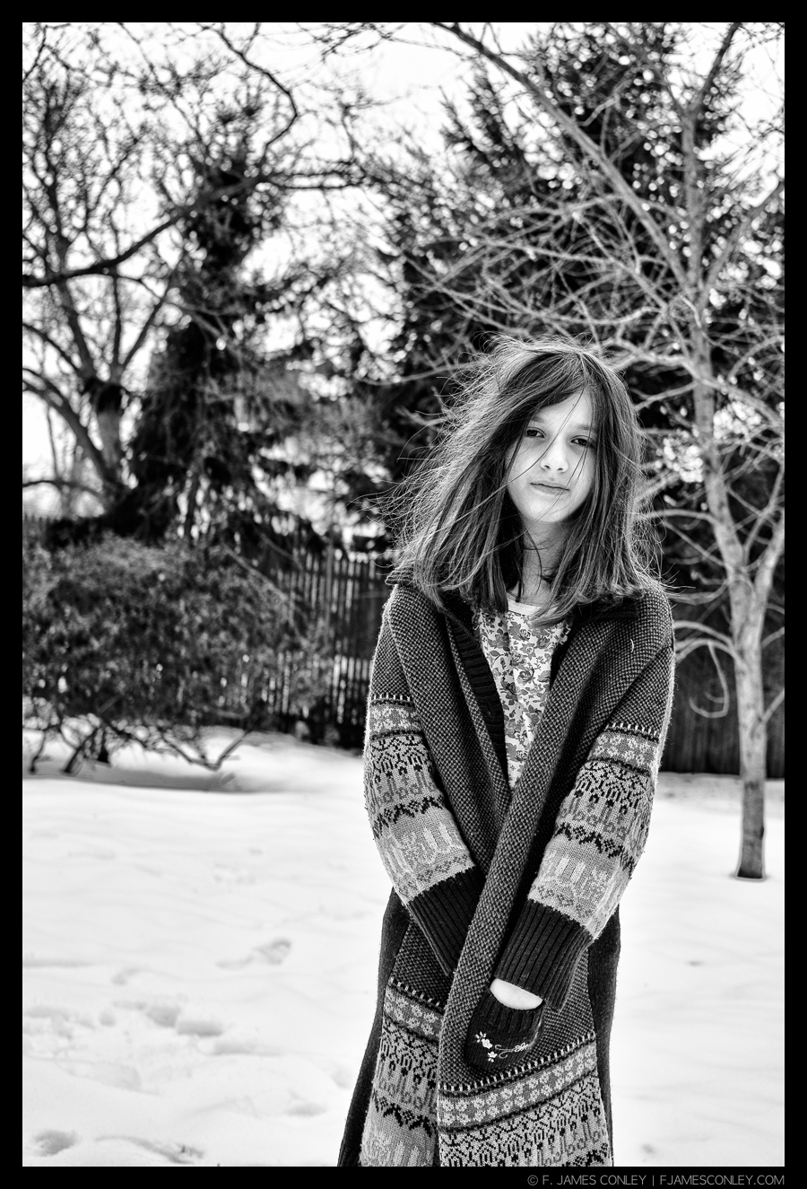
The second image improves upon the first by a simple reposition of the photographer so that the background becomes incorporated into the scene. The tree is out of the head, and the branches visually tie in to the girl's hair. Including more context in the frame makes the moment more informative, as well.
Find the Best View
Because of the importance of looking through the viewfinder as a final image, working on gestalt is one of the few areas where I do not recommend the use of a rangefinder. Rangefinders have a fixed magnification, and lens changes are shown with different framelines. This means there is a lot of visual information in a rangefinder that will distract or confuse the gestalt sense. Once you've developed your gestalt visual sense, a rangefinder isn't a problem. But I strongly recommend using a mirrorless or a DSLR body while you're working on gestalt so that the entire image is visible regardless of lens changes.
If a rangefinder is all you have, then use only one lens, and use the one that best matches the rangefinder magnification (i.e., I would use a 28mm on my .58 magnification M6TTL).
Application
Gestalt is best approached by breaking it down. There are four Gestalt laws that most readily apply to photography:
1) Proximity
2) Similarity
3) Continuity
4) Closure
These concepts are interrelated, and will often appear in the same image. They're all aspects of visualization which fall under the umbrella of "figure to ground." Put another way, a figure to ground relationship can be thought of as "signal versus noise." The goal is to control the signal to noise ratio so that our spectators can locate and identify the subjects of our image.
Importantly, "figure to ground" is just another way of thinking about "subject and context." It is not about layering an image from front to back. Instead, it's about controlling the visual elements to lead the spectator's eye.
This image uses a double frame to lead the spectator to the subject: the frame of the image, and the frame of the monument. In this case, the "ground" portion of the image is in the foreground, while the "figure"/"subject" is in the background.
When we make a photograph, we start with a 3x2 frame. As artists, we make choices about what is the figure (the subject) and what is ground (the background, or other aspects of the image which aren't subject). To help a spectator to rapidly identify the subject, we can use contrast to our advantage: setting off lights and darks is a quick way to aid visual identification. Making our subject stand out provides control over where the spectator's eyes will first be drawn.
A common way to handle the "ground" and emphasize the subject is to shoot wider open and blur the background. While it can work, it also deprives the spectator of detailed context for the scene. Sometimes that's a cost worth paying, but only if the background doesn't contain useful information.
As we make framing choices, however, we have other decisions to make to enhance the presentation of the figure on a two-dimensional plane, and to emphasize the idea and concept aspects of the subject. The first two factors influencing our choices (proximity and similarity) are subject based, while the last two (continuity and closure) are conceptual. We turn our attention first to Proximity.
Proximity
The closer together two visual elements are, the greater the probability they will be seen as a group or a pattern. The negative effect of this occurs in photography most often when backgrounds are ignored. Photographers are often most concerned with the subject when shooting, and it's only later in post processing—after the conscious attention of participating in the moment has faded—that we see the effect of the background.
Many a good picture reveals itself to be poor in post processing because of a failure at the time of shooting to think about the effect of translating the three-dimensional scene we are experiencing into the two-dimensional field the spectator will see as a print or on a digital display. When dealing with a two-dimensional field, space and distance are compressed. This means that things that we perceive as being behind a person when we are witnessing it with our eyes will compress in an image and may appear to merge. The classic example of this is the "tree growing out of the head" problem discussed above.
But proximity is also important in a positive way because it allows dissimilar things to be associated to communicate a message. This is one of the greatest powers gestalt provides in photography when experiencing a visual scene in two-dimensions. By collapsing three-dimensional space, we can associate elements in the scene, compelling the spectator to draw conclusions.
The images below feature collapsed space to communicate ideas: the Virgin Mary joins the group in looking her own way; a portrait of a woman looks knowingly on as two other women talk; a patron's head joins the display at a museum. None of these images would communicate the same idea in three-dimensional space, Instead, they all depend upon the two-dimensionality of the photographic frame to contain the scene and flatten the perspective.
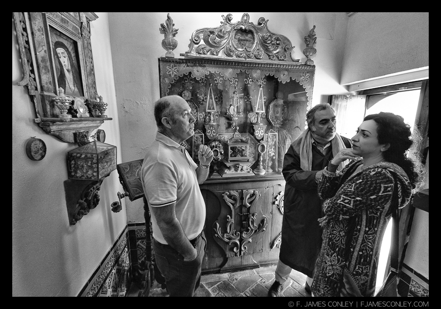
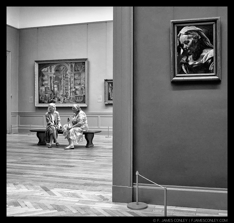
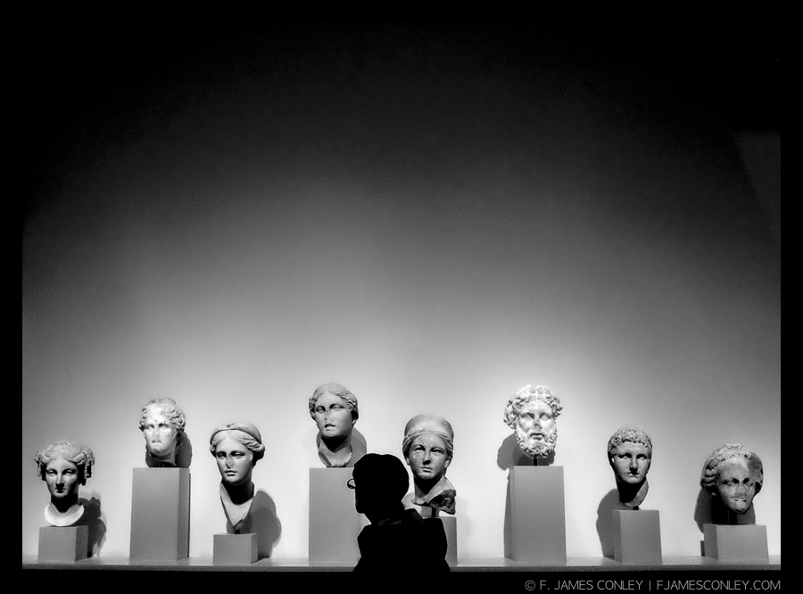
These associations are tricky because they require balancing several different visual elements, and photographers often avoid them by concentrating on a single subject. Moreover, use of contrast and controlling depth of field are vital to bringing together multiple visual elements, but the results can be outstanding and create an image that restores multidimensionality when it's viewed.
Next, we will tackle Similarity.
